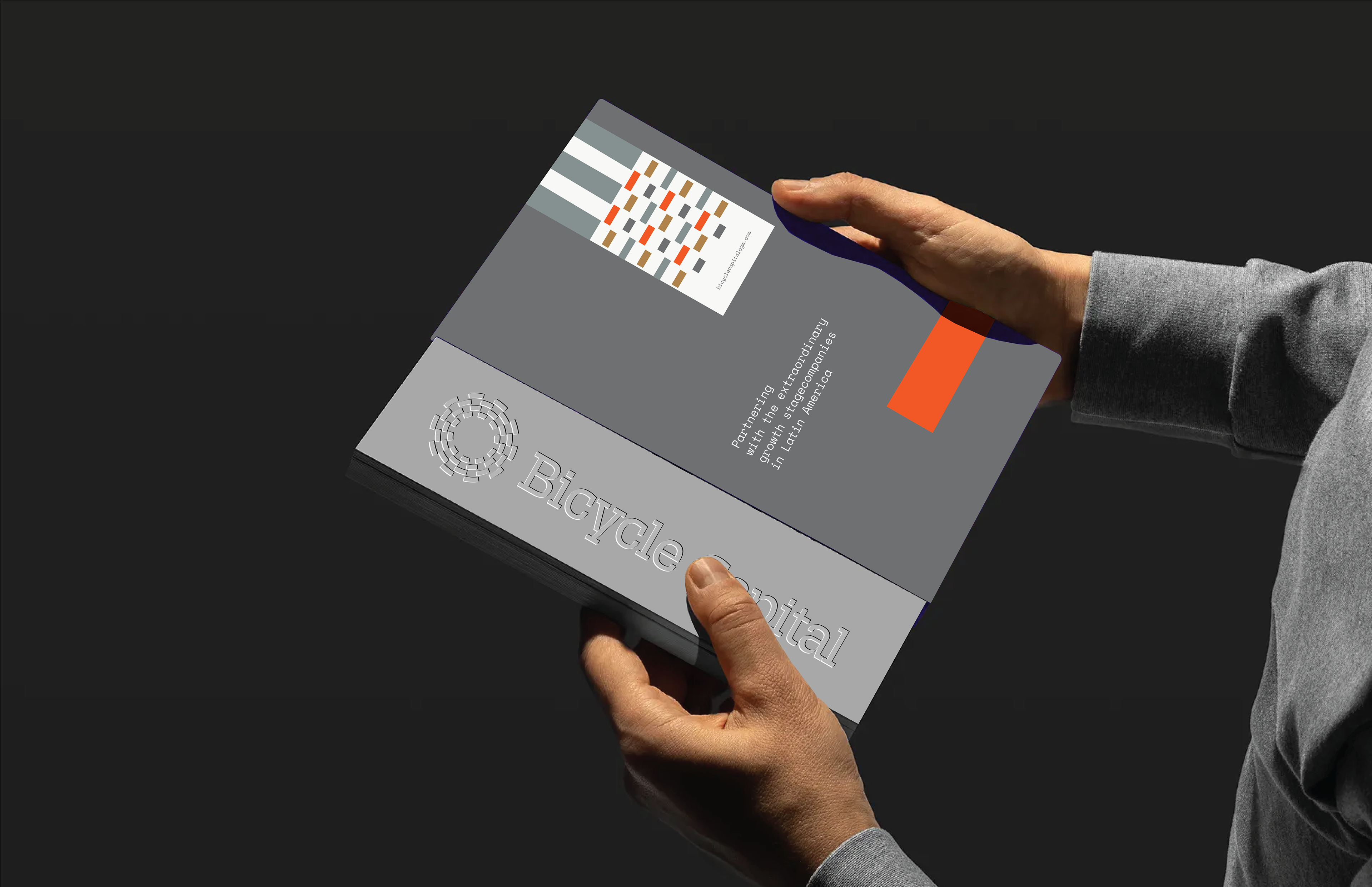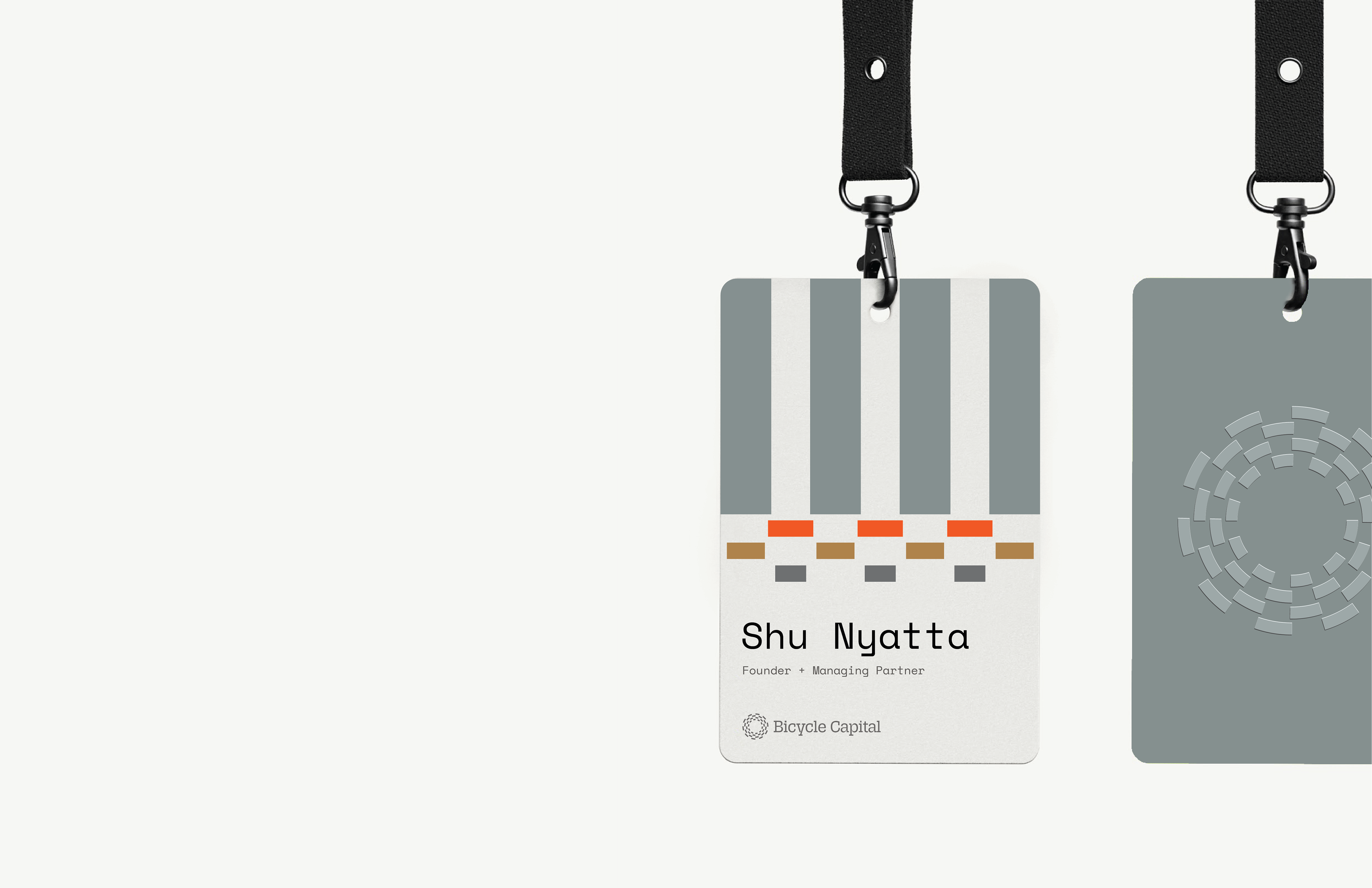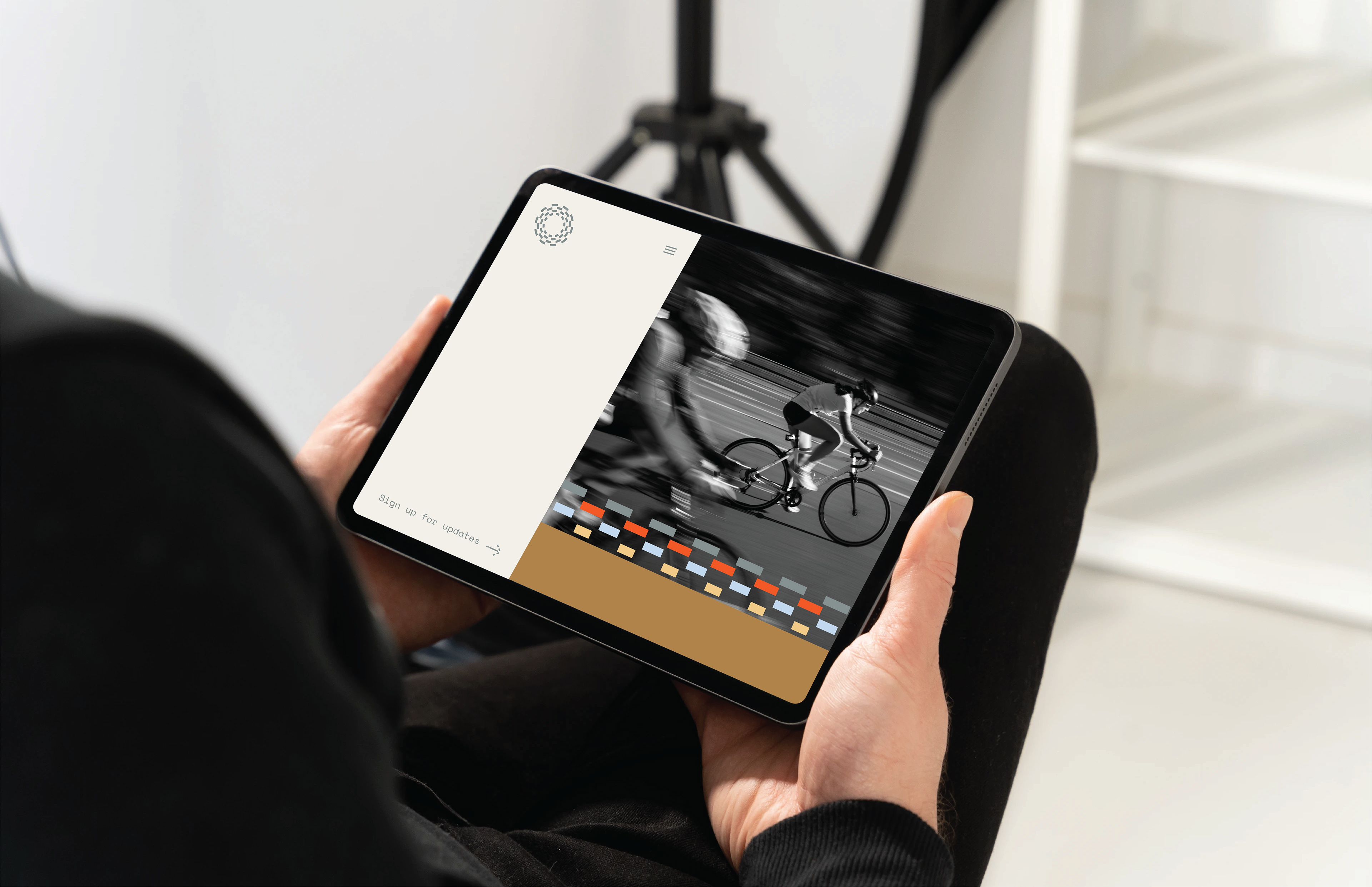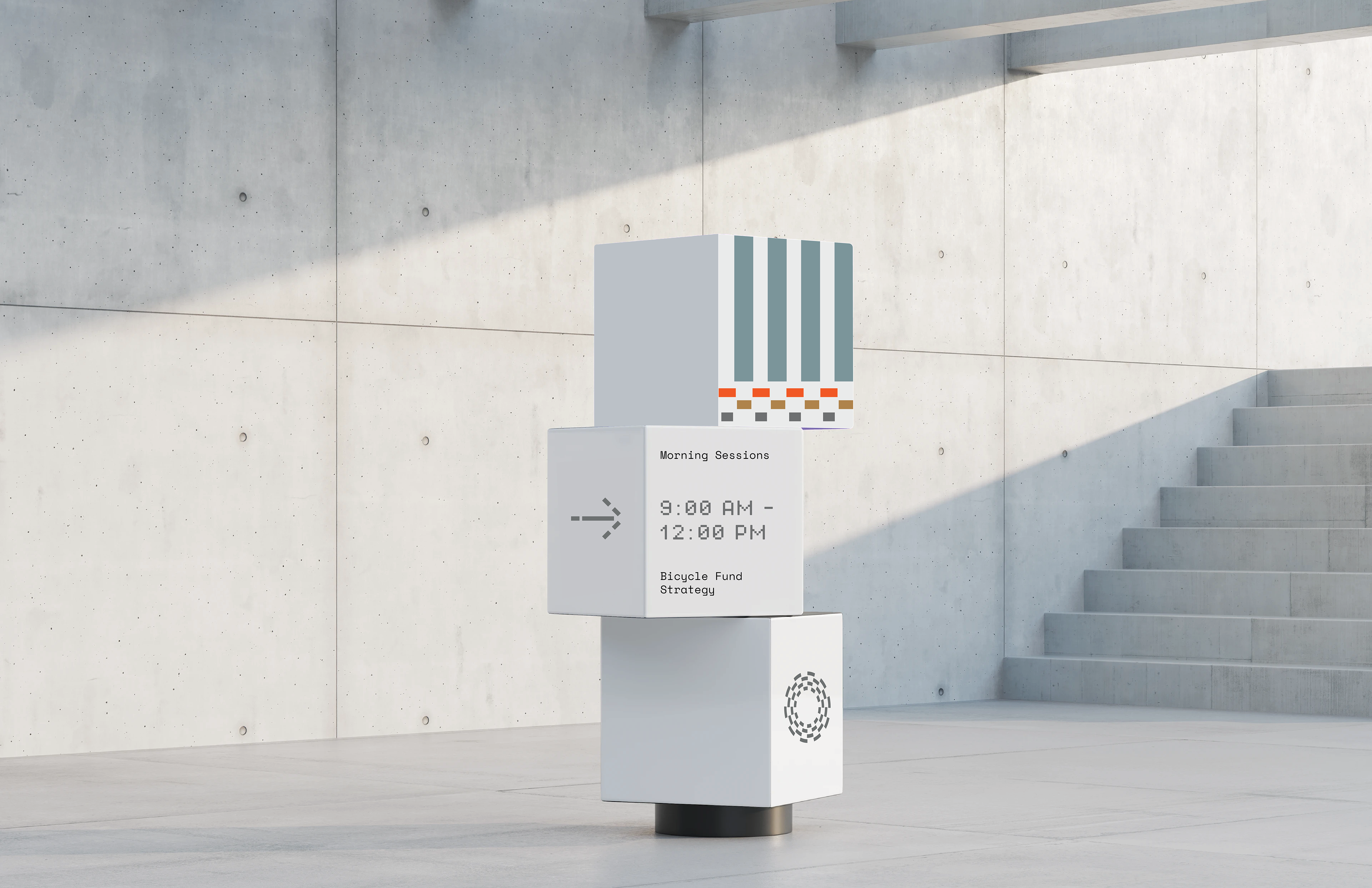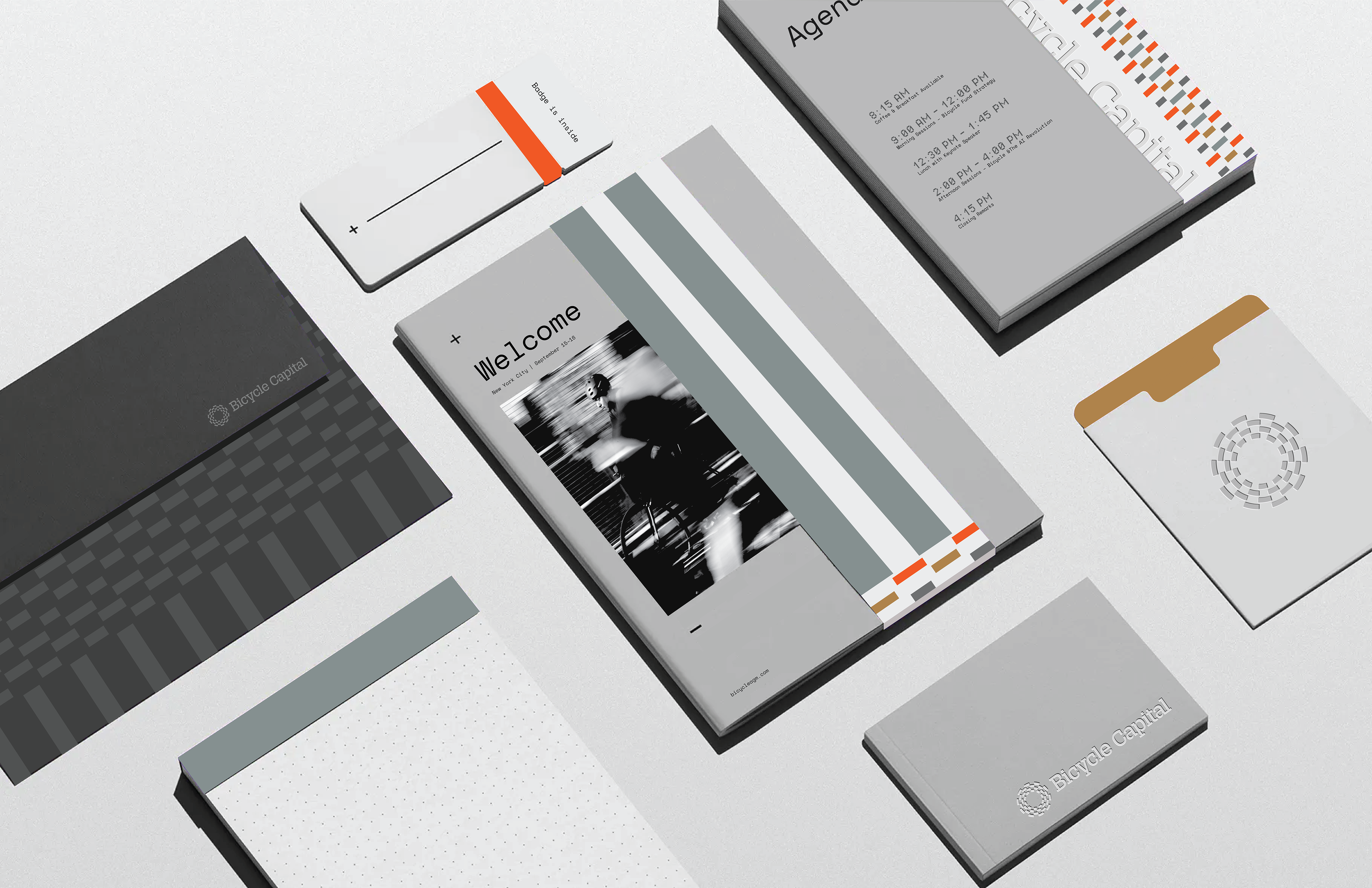
The concept for the event branding is rooted in evolution, not reinvention. Rather than creating a new visual language, it builds upon Bicycle’s existing identity to deepen recognition and amplify presence. By dissecting and reinterpreting the Bicycle icon, the mark becomes a flexible system — fragmented, repeated, and scaled into a dynamic pattern language that adapts seamlessly across all event applications.
Structured yet expressive, it strikes an elegant balance between art and design. Confident within a New York gallery setting and subtly informed by its Brazilian roots, the concept reflects growth, adaptability, and contextual awareness.